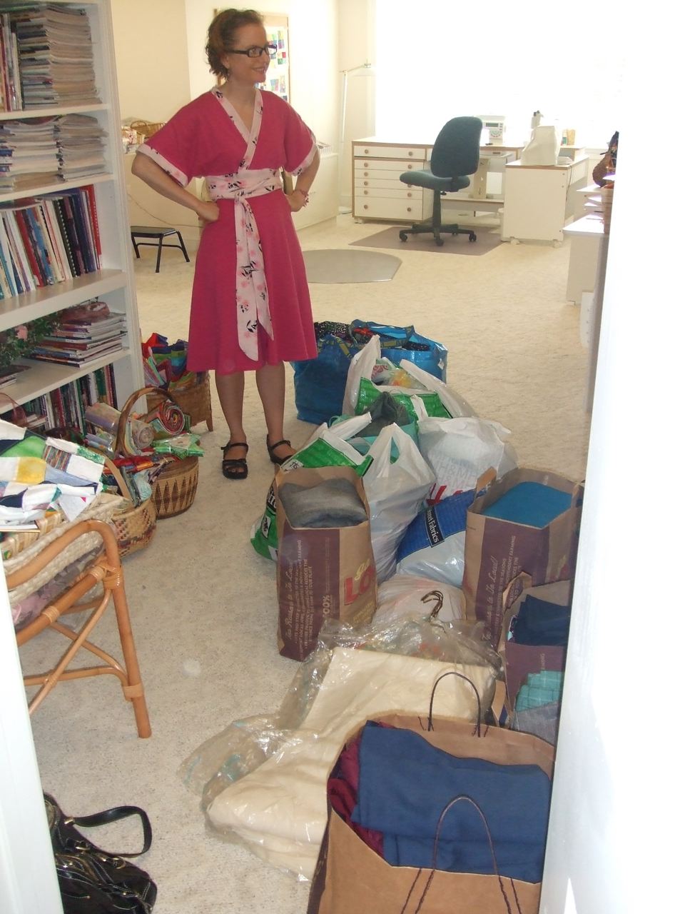
If you have a lovely, unlimited background it's easy to just crop your photo into a square. Unfortunately, my background is fabric draped on the rack of my canopy bed/auxiliary closet (I am in the process of shoveling out my room and took the clothes off the bed to hang in the closet and now I'm afraid I'm going to come home to find my closet rods have crumpled under the weight) and isn't as wide as I am tall, so I have to get a little more creative.
This does require a little computer savvy with your photo editing program, but really not that much and it doesn't require a hard-core program. I use a program called Picture It! that I got for free on a CD onto which I had Wal Mart develop film photos about six years ago. A google search says the program is still around, and possibly available for free download (I don't know how to figure out what sites should be trusted for downloads). It's not a fancy program at all--and my version is ancient in computer years--but it has all the basic functionality I need.
So the easiest way to get a square is just to crop your photo into one. When you're cropping, your program will tell you how wide and tall your cropped area is. Just make sure they're the same. It's a bonus if your background is an exotic foreign location, like Vietnam.
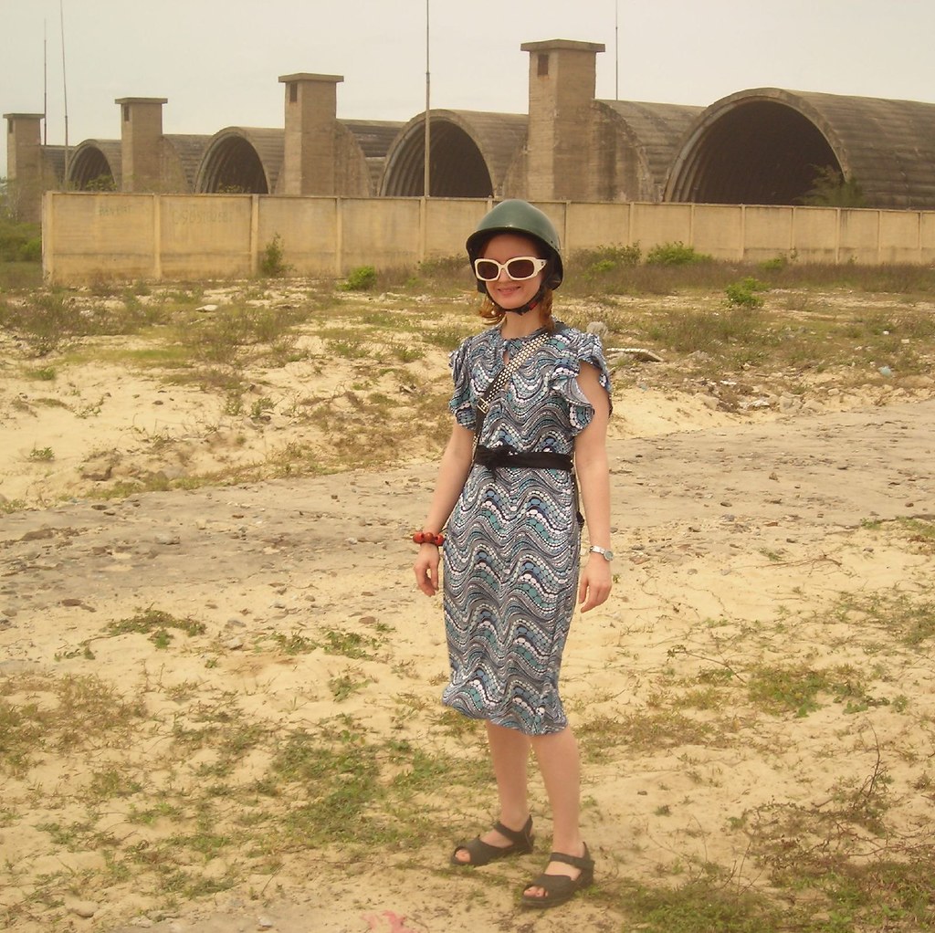
If you have a great background but not quite enough of it, you can get a little fancier like I did here:
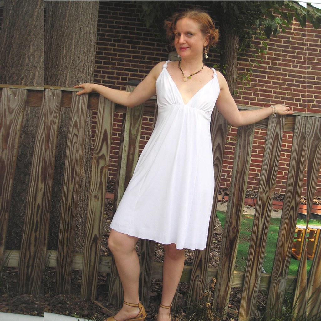
Do you notice anything about this picture? Like the double tree trunk on the left and the fence break on the right? I cropped the photo as wide as I could and then pulled that piece into a new project. Then I went back and cropped it again to get some more tree, and again for some more fence, and pasted those pieces in. I'm sure now that I've told you it's perfectly clear, but I don't think most people would even notice this without being told.
For tops, I can crop it square (I've learned to leave my face in the picture, it makes it friendlier). I like to fill in some of the space with info about the project, but it's not necessary.

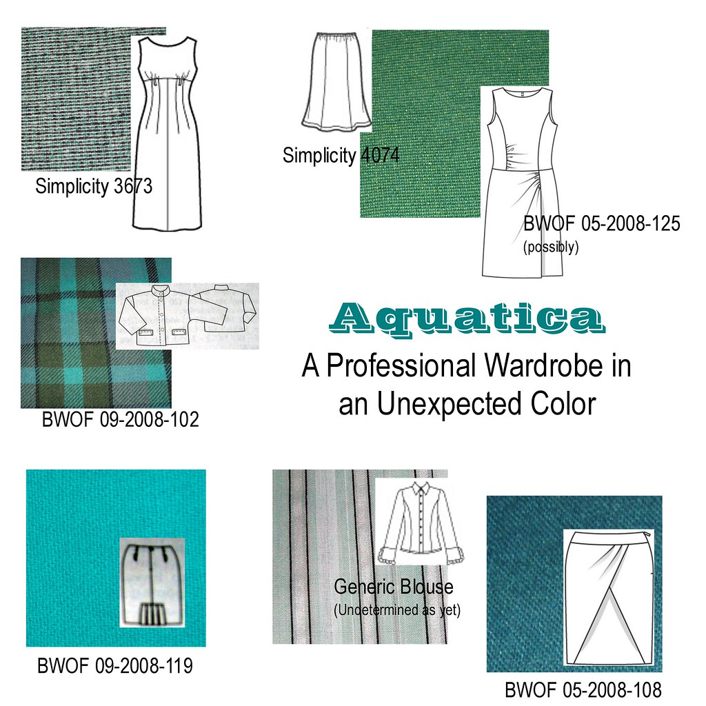
But for dresses, I generally go with some kind of "scrapbook" style layout. I can't give you a tutorial because everyone's program is different, but I suspect most of them work the same.
Start by creating a new project. In my program, it's just like in MS Word or Word Perfect. Go under file and then click "new." Then resize your new project into a square (my program automatically makes it 6x4, a standard photo size). I generally use 8x8 as my size, so that the resulting image isn't giant but has plenty of resolution.
Then drag your main photo in to the project and resize it by dragging diagonally at the corners until it fills as much space as possible. If you don't feel like doing any more, you're done. Just center your photo and have it white on the sides. Who cares! I generally go a little fancier, though, just for kicks.
For a photo that's fairly wide, I'll just stick with the one image and then add text along the side, like this:
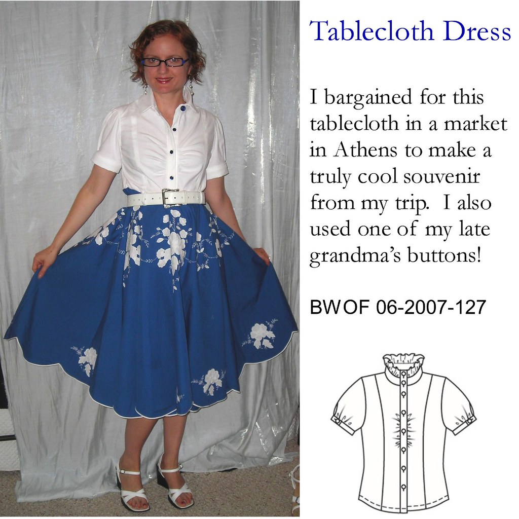
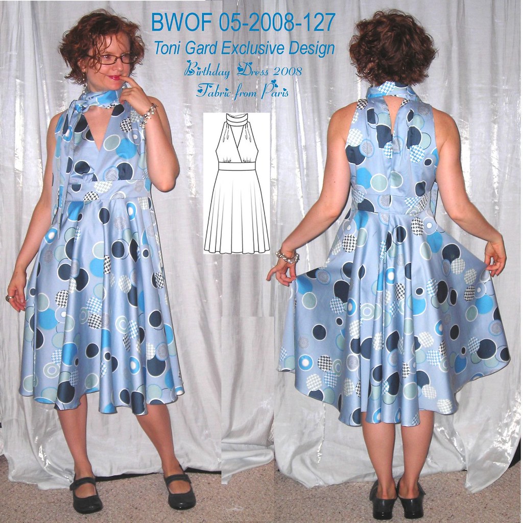
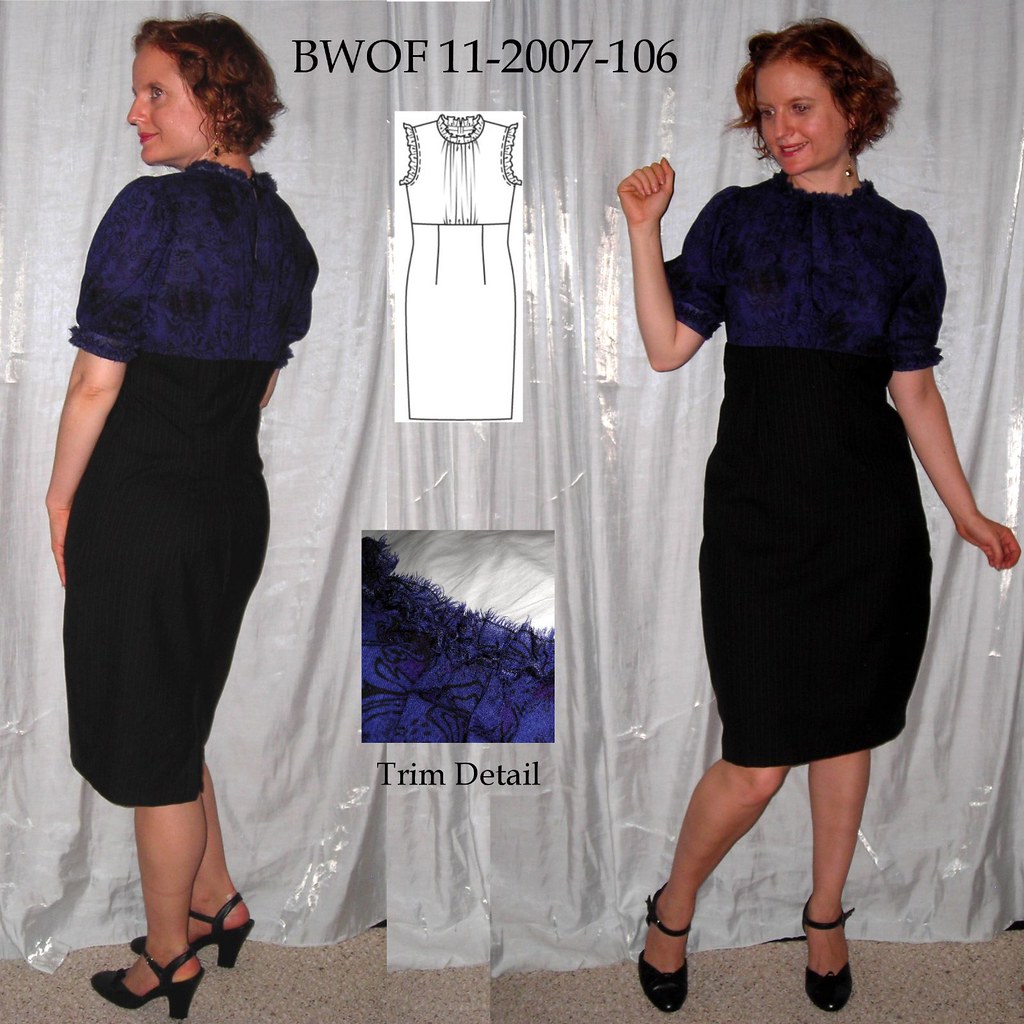
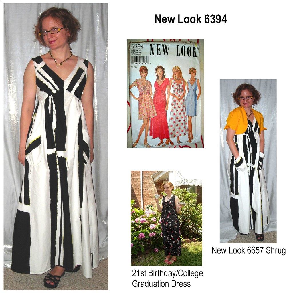
I like to include a line drawing or other image from the pattern so people can easily evaluate what they think of the pattern and my execution of it.
Here I tried to make the image a visual whole by adding in a box that matches the color of my wall before pasting in my pattern photo and adding text:
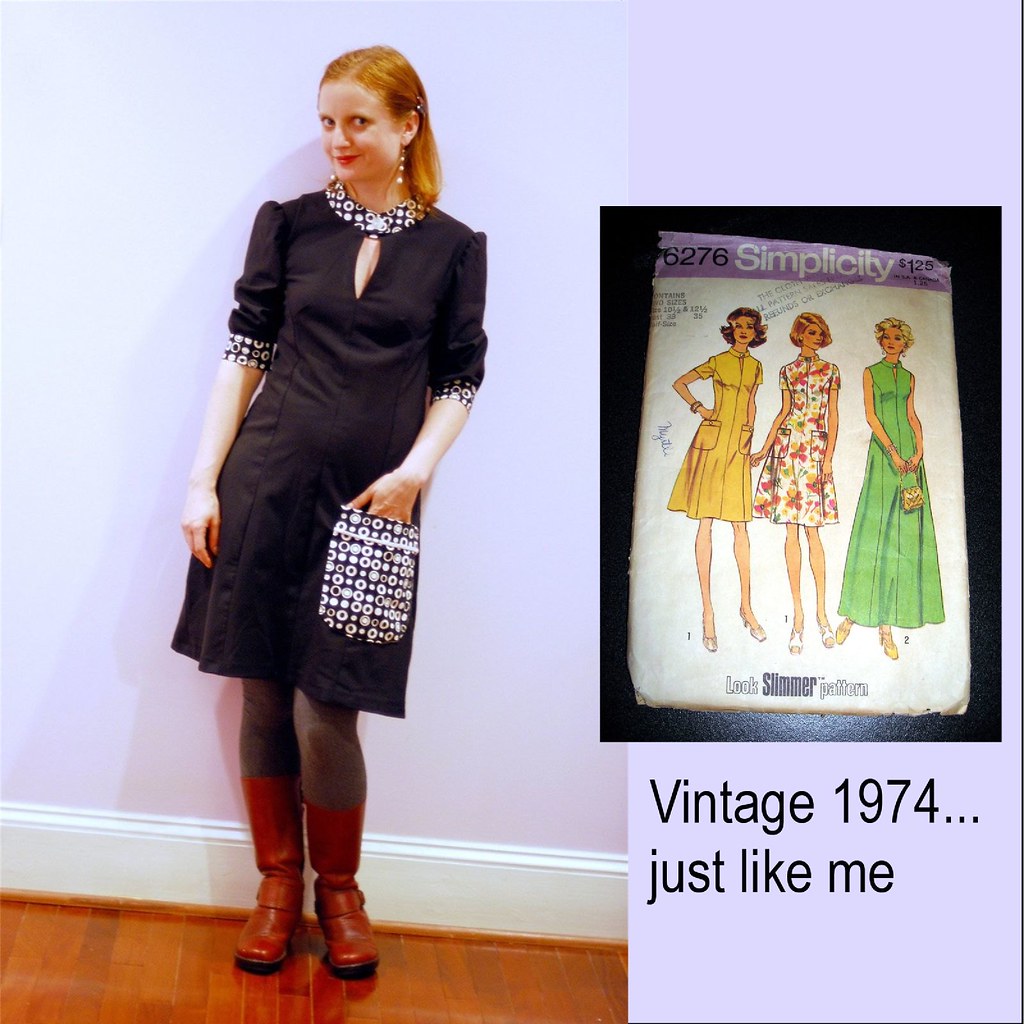
In the same vein, lately I've been doing a lot of cutting a piece of my background to fill in between two images. Here you can see there are actually four different photos that make this up: the front, the back, then an upper background in the middle, and a lower background in the middle. Had I not left a shoe on the floor in the range of the camera (oops) I wouldn't have needed to do the middle cut in two pieces.
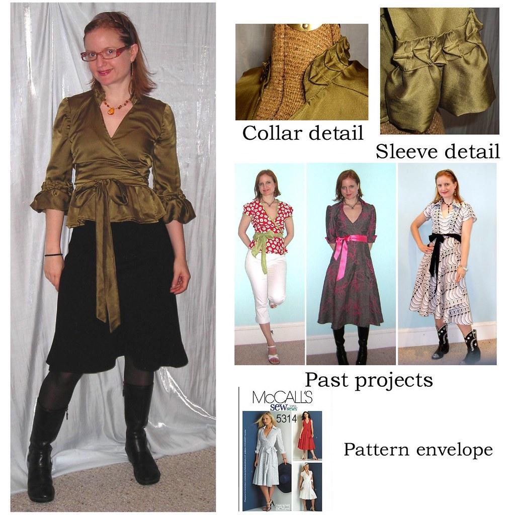
If this is the second (or fourth...) version of a project, I like to show previous iterations to highlight the pattern's versatility:
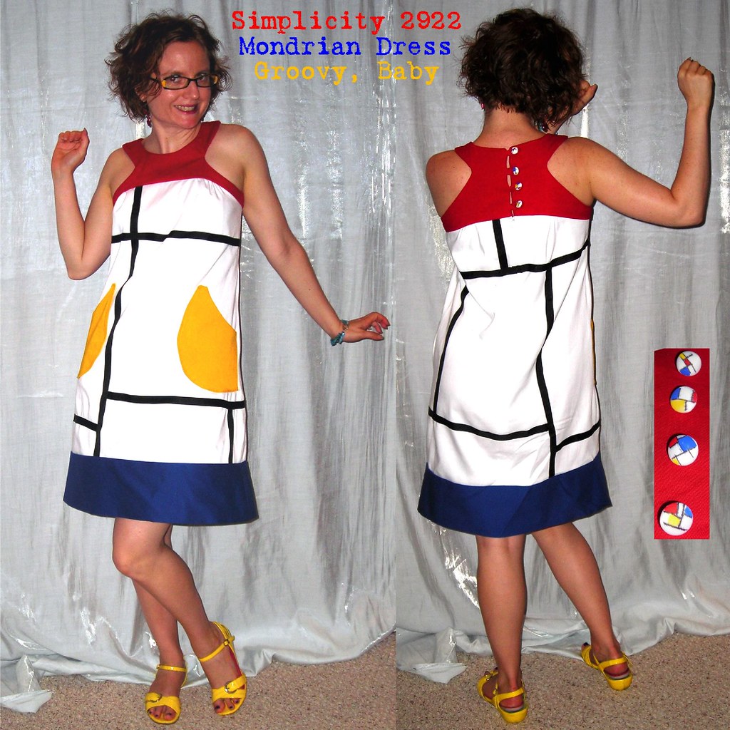
If a pattern is interesting from more than one angle, your thumbnail can highlight that:
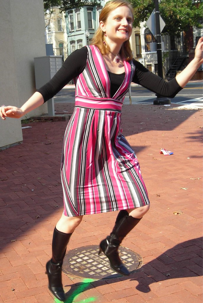
You can even use your thumbnail to tell a quick story:

When the square thing first started happening, I found it annoying and was a bit grumbly. But now I think it's kind of a fun challenge to come up with an interesting square composition. Also, if you're on flickr they display photos as squares, so it's great to have square thumbnails as my album covers.
I'm not sure how people feel about my scrapbook style. I can totally see how some might find it too visually cluttered when they just want to see some clothes! But I like having a quick reference photo that gives information about a project to help people decide if they're interested in the review or not.
Quick Tip: On Pattern Review, you don't have to have the same photo as your thumbnail and as the main linked photo. So you can upload a square thumbnail to show in the gallery, but link to a photo of any size or shape, which will pop up in the "click to magnify/shrink" window and when somebody goes to the review and clicks on the thumbnail it will take them to the linked photo.











.jpg)


