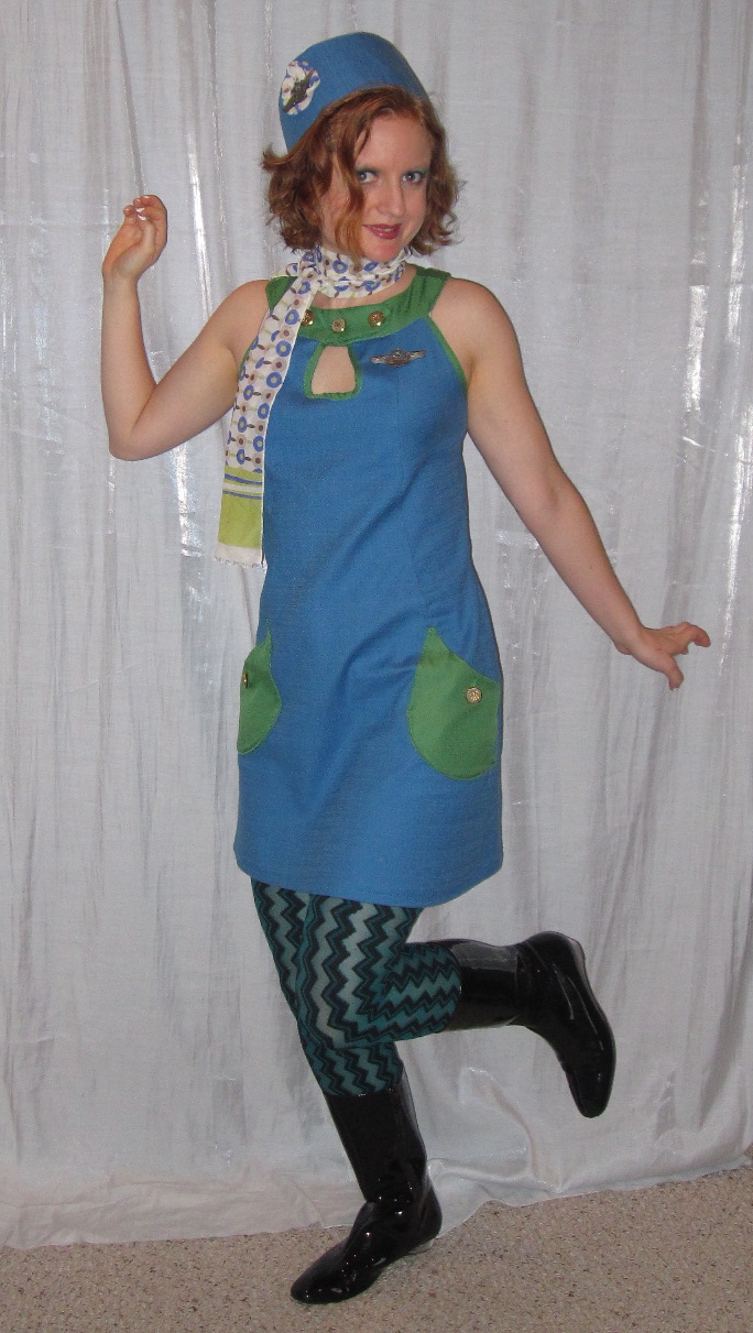
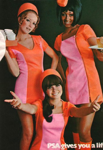
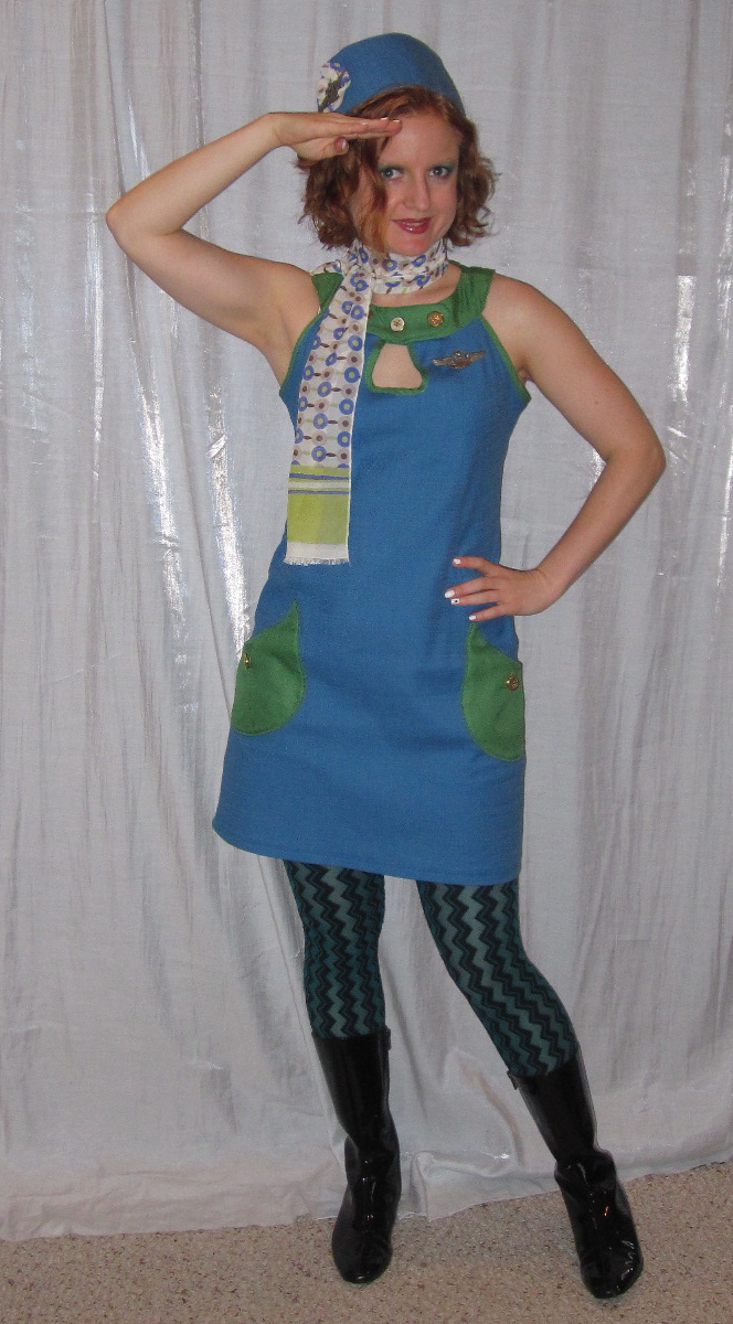
 When planning this costume for last year I had been unable to decide between and Simplicity 2927 and Simplicity 3559, a 1960s reissue, but I ultimately decided that S2927 offered more opportunity for using two colors and went with that one.
I had only one day to sew the dress because of my travel schedule, but it's an easy pattern to make. I picked up the blue fabric, a sort of faux-linen with a lot of stretch, from G Street Fabrics' $2.97/yd table; there was only a little over a yard and a quarter, but since I was making a short dress I figured it would work. The green is a poly crepe from Joann's Casa Collection, $4.80/yd with coupon.
I kind of hate to rip on Joann, because it is handy to have a brick and mortar store I can pop into for notions and I don't want them to go out of business, but can we take a moment to talk about how awful this Casa Collection poly crepe is? If my "special occasion" dress was made out of this sh!t I would cry. I mean, it goes without saying that the hand is horrible; just touching it makes you cringe. It is thin and flimsy *and* it ravels. The crepe-y texture is mystifyingly gross (like, what higher class fiber could this possibly be imitating?). And it's not even cheap! I really hope all the sewists out there who don't have physical access to anyplace other than Joann have discovered that you can order better fabrics at a lower cost online.
 Anyway, I had planned to make the side princess panels out of the contrast green, but the thought of having this fabric up against my skin other than at the neck was unbearable so I cut the side panels out of blue; I had to cut them off grain to fit everything onto my limited fabric but it doesn't appear to be pulling the dress out of shape. I really wish the pockets had been drafted onto the side princess panel, it would have been much more sophisticated than just a patch pocket. But I did not have time to redraft so I stuck with the patch pocket motif. I really liked the way EvLouise's version on Pattern Review turned out with the contrast collar and pockets, so I went with that. Of course, after I went back to look at the reference photos I saw that color-blocking was a popular thing!
To bring in the green more I finished the armscye and keyhole opening edges with bias tape made of the green. I am not sure there is really any point to polyester bias tape as it doesn't steam into shape, obviously, but it actually worked better than I expected. I used my bias tape maker and got faint iron impressions onto the bias strips, which allowed me to line things up. As usual, the Simplicity armscye was too tight on me as drafted, so I trimmed off about an inch at the bottom, scooping out more at the lower front than the back, tapering to nothing at the shoulder (other than, in this case, trimming off the seam allowances for the bias tape finish).
The keyhole opening is to be accomplished, according to the pattern, by cutting a small rectangular facing, placing it right side to right side, stitching around the small keyhole opening as drafted, clipping, and flipping. Yuck. That is asking for the worst kind of flapping floppy facings. I wanted a more exaggerated opening so I cut a teardrop shape keyhole and finished with the bias tape.
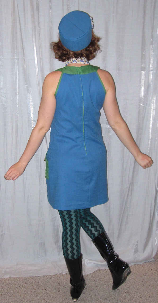
 I took a huge swayback tuck out of the back pattern piece, as per usual. Even with the tuck I had to majorly contour the center back seam to get a decent fit. This ended up shortening the back hemline significantly--I cut about two inches off center front to hem and zero off center back--but luckily this is meant to be worn short!
 I had deliberately chosen a green regular zipper (rather than my normal choice of invisible), and was considering making it an exposed zip but decided that would be going too far. Then I thought of doing a lapped zipper, but (1) this is a technique I have only done once before, and (2) I feared with the highly contoured back seam the lap would gape open. So I just did a regular zipper installation. I used to be so good at regular zippers, but I have been on invisibles so long that I have totally lost my touch!
 As the dress took shape, I began to get concerned. It turns out there is a fine line between "Retro Air Hostess" and "Diner Waitress." Diner Waitress just does not offer the glam I'm looking for. I knew the hat and scarf would make a difference, but I wanted to jazz up the uniform to make it look a little more "martini" and a little less "milkshake."
 I wanted the pockets to be functional so I wouldn't have to carry a purse (did not have time or inclination to make or find an old school flight bag), so I added buttonholes and used gold buttons to close them. The collar is not intended to have functional buttons, so I just sewed three buttons there for decoration. I felt that this added the necessary punch to the uniform.
I loved this pattern for the uniform, but I don't really see it as regular clothes for me. It's very similar to Simplicity 6276, a 1974 pattern I made last year and I haven't ended up loving that dress (I think it will get purged in the next Goodwill run). This has a narrower profile, while S6274 is more A line (which I am down on right now), but the band collar is just not my scene.
All photos are here and the Pattern Review is here.


.jpg)


10 comments:
I think you hit the mark!
I think the keyhole neckline was a real key to making this airline hostess rather than diner waitress.
It's just freakin' cute and if it were mine I would definitely put it in the closet for another costume occasion.
That is so adorable!
love it. I was a stewardess this year too. Of course, I think my airline was a bit more staid than Branson! I'm hoping to get my hat review up on patternreview soon.
Great costume, you really look the part!
I love the salute pose! Very cute!
Very, very cute.
Cute costume - it all works!
And what about the hat? Did I miss the update on it? It just *makes* your outfit. Is it from your JPN hat book, or did it come with the pattern? Or is it RTW?
This is truly very cute costume. I understand your feelings about the green fabric!!!!
Post a Comment